

Engaging dashboards: the art of data storytelling
- Build dashboards that resonate by tailoring them to meet the specific needs of your audience
- Design dashboards with a clear purpose that aligns with the goals of your intended users
- Highlight the most important data to empower users with clear and actionable insights.
Read more
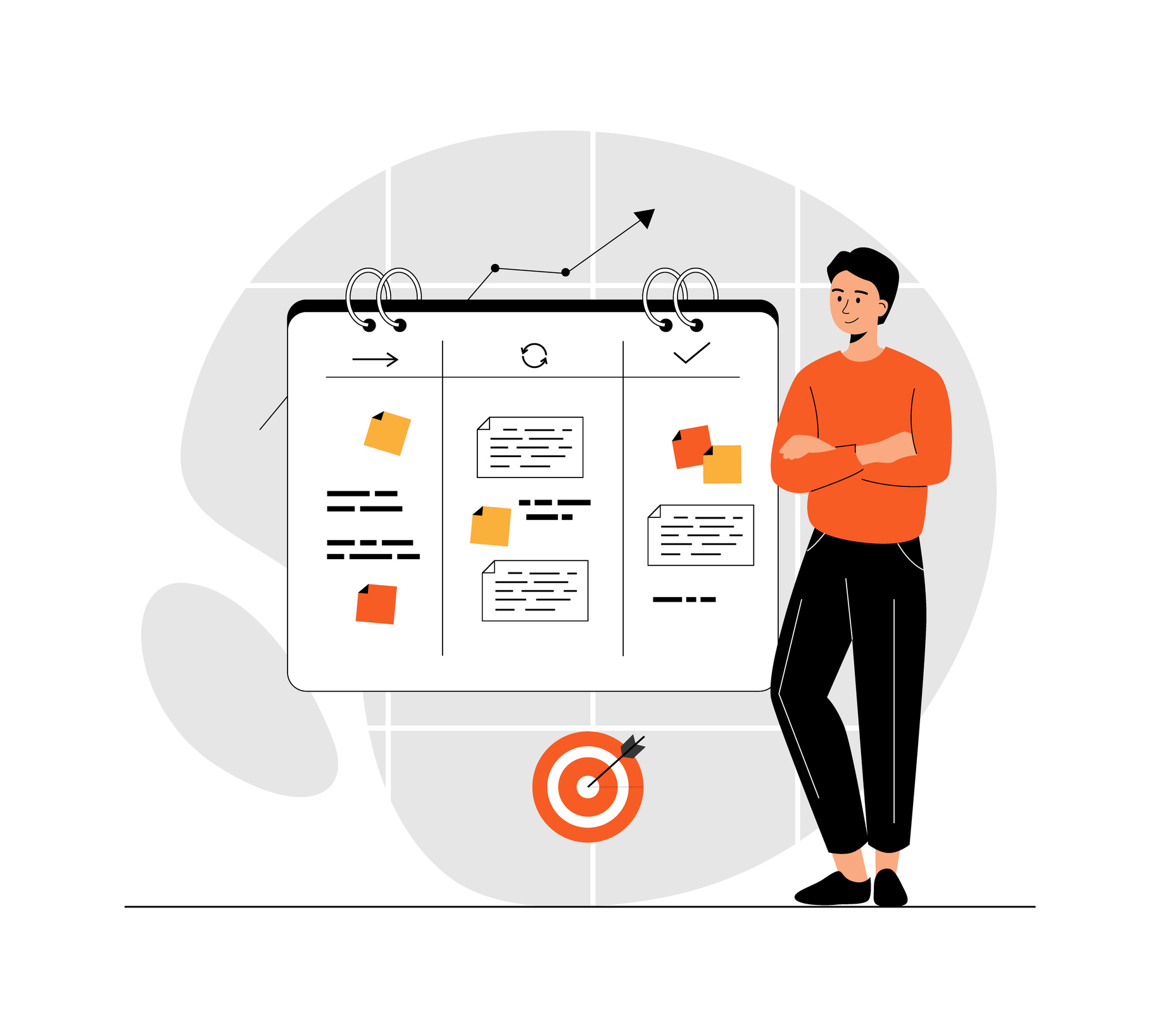
Creating dashboards that inspire action
A captivating dashboard goes beyond data visualisation—it tells a story that communicates insights effectively and resonates with your audience.
Key steps to build purposeful dashboards:
- Define your audience: understand who will use your dashboard and customize it to meet their unique needs.
- Clarify your data’s purpose: ensure the dashboard aligns with audience expectations and provides relevant information.
- Focus on key insights: highlight the most critical insights to help users make informed decisions.
Watch our presentation to learn how to craft dashboards that not only present data but also empower stakeholders to take meaningful action.
Tailor your dashboard design to your user
Dashboards that inspire action should have a design that aligns with the specific needs of its intended user. This entails including relevant data points and visually engaging elements that resonate with the user’s business goals.
Depending on their roles and responsibilities, we typically categorise dashboard users into three levels:
Executive Level: your top decision-makers will likely seek strategic insights and a high-level overview of your business performance to make informed decisions and drive the organisation’s success.
Central Teams: whether you’re part of the CX, People, or Research team, or if you’re a People Manager, Team Leader, or involved in Call Center, Customer Service, Digital, or Product Development, our dashboards are tailored to provide insights and analytics that are directly relevant to your specific responsibilities.
Frontline Teams: from Call Center and Customer Service to Locations, Stores, and Regions, we can build your dashboards to ensure that everyone on the front line has access to the data and metrics they need to excel in their day-to-day operations.
Make your dashboard easy to use
Set a clear goal: start with a specific objective aligned with your end-users’ desired outcomes for actionable, effective dashboards. Avoid clutter by limiting data points and visuals.
Enhance usability: use filters to let users customise data views while maintaining the dashboard’s key message. Add a Navigation/Introduction page to include program details, resources, and How-To guides.
Choose the right charts: select charts that best represent your data—bar charts for comparisons and line charts for trends—ensuring insights are easy to grasp at a glance.
Align with reporting needs: design dashboards that match users’ reporting timeframes, such as monthly metrics for executives or annual benchmarks, to improve usability.
Optimise for access channels: ensure dashboards work seamlessly across desktop, mobile, or apps to accommodate all user needs, including frontline staff.
Speak with Act XM today to discover how to design intuitive, actionable dashboards that drive meaningful insights.
Unlock Act XM's expertise

Capture every voice, everywhere
CX that clicks. The channels, choices & moments that matter most.
What’s really driving experience in 2025. What it takes to stand out when “satisfaction” is no longer enough? Download the full report.

Qualtrics automations
Drive impactful Customer Experience (CX) with Qualtrics automation. Learn how to streamline workflows, integrate with your systems, and gain real-time insights.

Leveraging CX in Energy & Gas
A strategic focus on CX helps Australian energy and gas companies navigate rising costs, regulatory shifts, and evolving customer needs…

Local Government CX Benchmark Study
Discover how local council interactions reveal key insights to boost citizen satisfaction and enhance digital communication.

Shaping CX in Waste Management
In a highly competitive industry, with customers constantly seeking better service, value, and ease of engagement…

B2B Customer Experience
Transform B2B customer experiences with actionable strategies to drive loyalty, value, and long-term success.

Text Analysis
Unlock customer insights with text analysis to understand sentiment, identify pain points, and make data-driven decisions.

Digital Experiences
Explore strategies for improving digital surveys, measuring experiences, and leveraging digital intercepts for deeper insights.

Mastering CX Metrics
Measure and align CX metrics like Emotion, Effort, and Success to enhance customer care and brand strategy.